— iIT-Services

Archive
Tag "Chart"

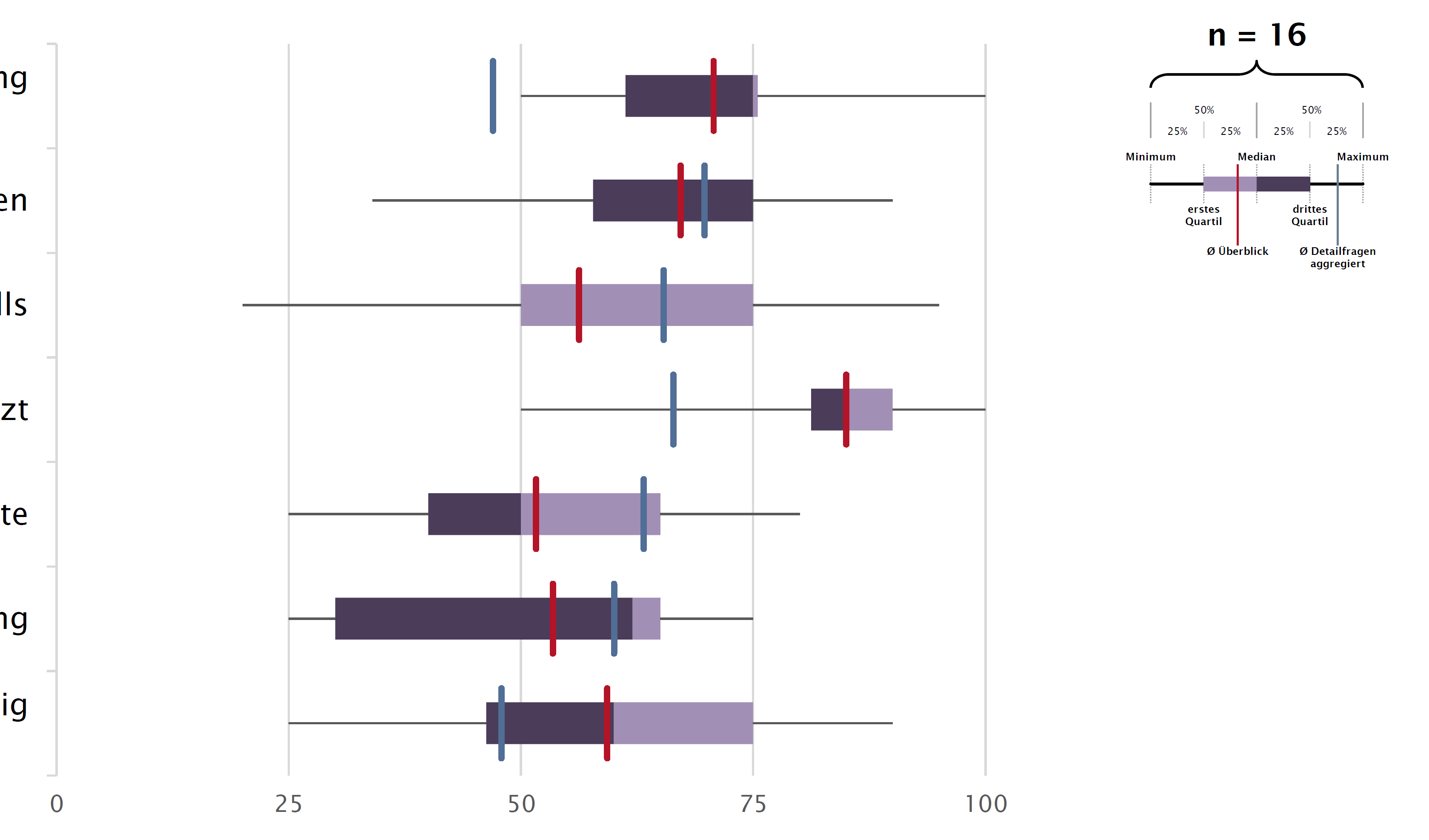
I was wondering, how can I add vertical line metrics to a horizontal bar chart or box-plot in Excel, as for example shown below in a box plot.

This is explained, step-by-step, in the tutorial that can be found here: https://www.exceldashboardtemplates.com/step-by-step-horizontal-bar-chart-with-vertical-lines-tutorial/.

Read More

A Butterfly chart is a chart where two entities are compared side by side using scales meeting at the center. Due to its shape, the chart resembles a butterfly and hence the name. These charts are sometimes also known as Funnel or Tornado Charts though I find “butterfly” to be a better description as it allows for a greater variation in shape than a funnel or a tornado does: http://www.databison.com/butterfly-chart-excel-chart-with-dual-converging-scales/.

Read More